As the technology growing day by day, people are more tend to use their smart phone than their computers. Android and iOS market is on boom now a days. Two out of three have smart phones, it has become a part of our daily life whether it is checking your emails, going on your social network, chatting, sharing pictures, audios or videos and surfing websites. It has become very important for the organizations who are into online services or ecommerce business to build mobile friendly websites. According to a survey report, more than 60 percent of the users leave a website or online service if it is not mobile friendly. Similarly, more than 70 percent users would like to return to a mobile friendly website.

Above numbers clearly state the importance of having a mobile friendly website to run the online business. There are many tools that are available in the market to test the mobile readiness of any website. Remember the last time you went to a non-mobile friendly website and tried to zoom in and out, sliding right to left made you so mad and frustrated that you decided not to visit that website again? Yes, it happened with most of us. Below are top 4 reasons why a website is not mobile ready:
- Font of text is too small to read. In this case user will have to zoom in order to read the text properly.
- Website content is wider than the mobile screen itself. So, user will have to slide from left to right or from side to side to read and see the whole thing.
- Links are placed very close to each other. Mobile ready website is the one in which user can easily choose and click the link to open it. But in non-mobile responsive website, links are so close that user does not able to tap or select until and unless he zooms the screen and click on a link.
- There is something called mobile view port (more on a technical side) which should be set properly in order to set the width of the screen to accommodate the website contents on the mobile device screen. If the website is mobile responsive then it will automatically get set according to the screen width.
As the mobile ready website market is increasing, there are many tools available to test it. Some of them are mentioned below with the result images:
- Google Mobile Friendly test: https://www.google.com/webmasters/tools/mobile-friendly/
This tool looks like:
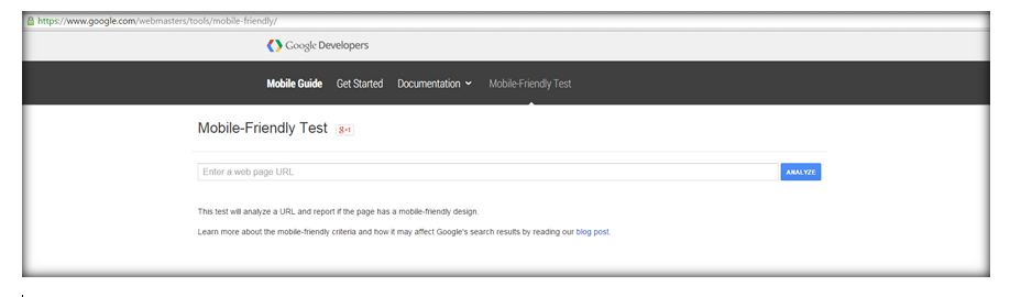
You just need to enter your website URL in the space provided and click “Analyze”. This tool will let you know whether your website is mobile friendly or not and if not then will give the proper reasons too so that you can fix it. Few common reasons we have already discussed above. Result will be shown like this:
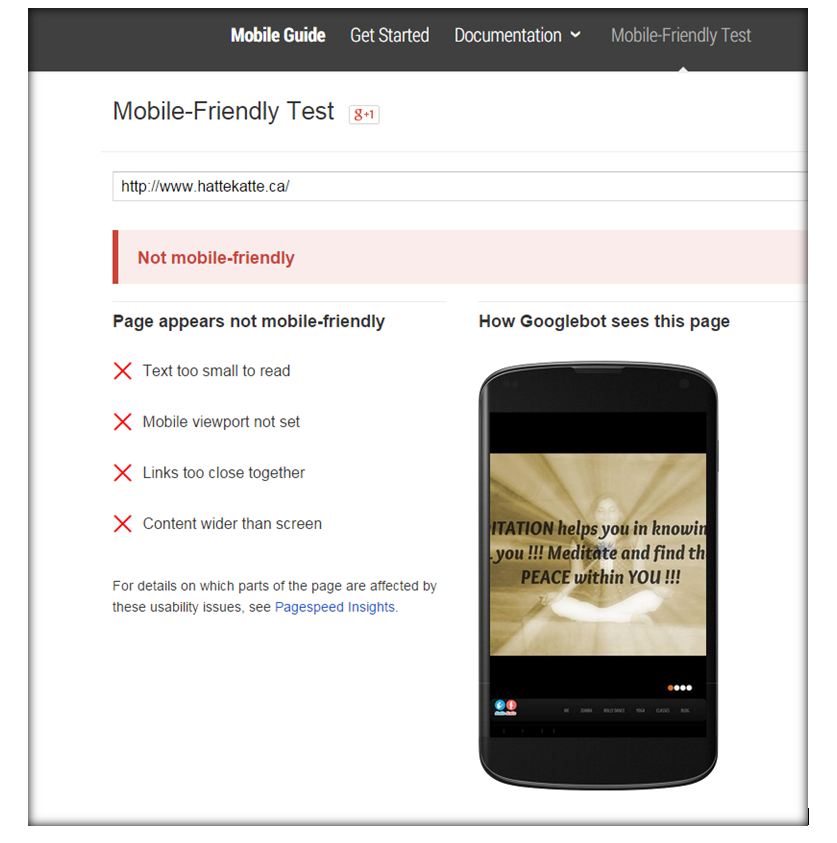
Simple to use and gives straight forward result.
- W3C mobileOK Checker: http://validator.w3.org/mobile/
Screen looks like this:
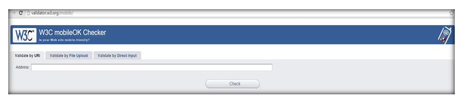
You have to put URL of your website in the space provided and press “Check”. Result will be shown as:
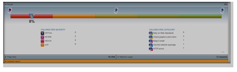
Here this website is 8% mobile friendly and detailed report is also given along with the summary. This has failure report as per the severity of the issue and also failures per category. In detailed report, each of the issue is explained properly.
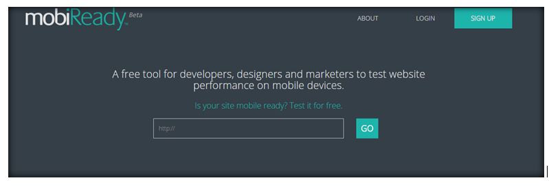
- MobiReady – http://ready.mobi/
Screen for this tool looks like:
This tool has visualize side and also the theoretical test results. It shows the website on all types of devices (Shapes and sizes). See this:
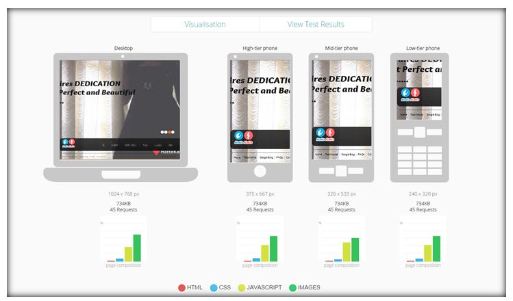
Whether you have high, low or medium tier phone, it can show each of them. Colorful graph shows each of the field, HTML, CSS, JAVASCRIPT and IMAGES. In above case, images are really big in size which effects the overall performance of the website so now we know what is needed to be fixed here. And this tool gives the overall score which looks like this:
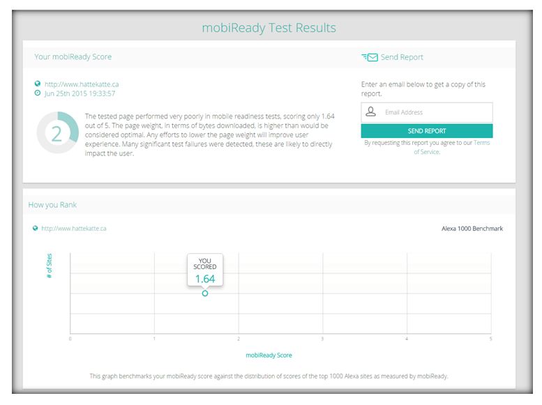
Here the score id out of 5 and 1.64 is considered as poor. With the detailed report at the end. User can also email this report to his email address in order to analyze and fix.
So we saw 3 tools which are very simple to use yet effective to analyze the results. All three of them have different ways of report format. One gives the score, other gives the percentage and third ones gives the straight results with the reasons. One doesn’t need to have a special skill to use these tool and test the mobile readiness of any website but one needs to know how to fix the issues. Many other tools are also available in the market along with these three. You can always find a better tool if you do the search.
If you know or use any of such tools, do mention it in the comments below.
⇓ Subscribe Us ⇓
If you are not regular reader of this website then highly recommends you to Sign up for our free email newsletter!! Sign up just providing your email address below:
Happy Testing!!!

7 thoughts on “How to test mobile readiness of any website?”
Good article
this is really very good information. thank u very much
It’s really very good article
I am looking for the information related to browser Javascript related support testing. Please share the details if you have anything on this?
Thanks in advance,
Thanks for such a valuable info. on website test mobile readiness.
Very Useful, I got very useful info here.
its very useful and such a valuable info