
We all have experienced this at least once, when we are trying to surf website on mobile to see a particular area of the website. We are zooming in by taping on the screen like a thousand times. It is annoying and at the same time we lose our interest. As a result it could be a potential loss to the website business. As the organization has lost a customer by not opting responsive website for its business.
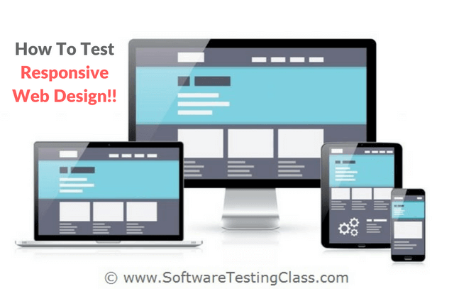
In this article, we are going to learn “How to test responsive website”. Also learn about related factors which are worth considering while testing Responsive web design.
What is exact meaning of Responsive Website?
Responsive website design is the web design approach aimed to view websites on different devices, resolution. Checking that able render and adjust the page to provide optimal viewing experience.
Let’s say if user switches from mobile view to desktop/laptop/ipad view or vice versa. In such cases website page should render automatically and set best possible screening experience.
Responsive website is compatible with multiple devices like all browsers, resolutions, screen sizes on different screen size desktops and devices like Smartphone, tablets etc. It is very important to test the responsiveness of the website for excellent user experiences.
When a website is developed, main concern of the client is RWD (Responsive Web Design), since it is easier to see and shop from our mobile device then to open our PC and surf. We carry our smartphone everywhere with us so it is an extremely flexible option for us. No matter what size of the smartphone screen you use, RWD should be compatible with all of the varieties. That is why most of the “ready to use” web designed or themes come with responsiveness. So developer just needs to write the code for the website and not to worry about the responsiveness.
Components of Responsive Website:
A website designed with RWD mainly uses with fluid grid, flexible images, percentage based grids, Media queries with CSS3 styles as per following:
- To resize the page element most common concept is used in RW design is fluid grid. Instead of using absolute units like points or pixels for element, it uses relative units like percentages.
- RWD are implemented in different coding languages like PHP, .Net, Java and many new technologies which supports RWD.
- For image resizing to prevent the images goes beyond the defined grid on different resolution, flexible images are resized using relative units.
- Media queries are most commonly used to set different CSS style for different resolutions. It looks for the width of the browser to apply the appropriate size based on the width defined.
- Using power of HTML and CSS can implement RWD with ease, few of the features of CSS and HTML allows you to resize images, screen resolution automatically.
- Responsive website design works on the lower and upper limit to resize the website. Most of the time the breakpoints are defined based on the width of the website, if the website goes above or below of the break-point the appropriate web design gets applied.
Difference Between Responsive and Adaptive Design
This is most common question is being asked while testing RWD. I think this is very good question.
The responsive sites and adaptive sites are sites which changes the appearance of based on the browser width. The main difference is responsive website changes the appearance after changes in width of browser every point. For example, if the browser 1024 px wide and width changes below or above 1024 px then layout will respond accordingly. Responsive sites adjust the layout fluidly not considering on which device is being used.
The adaptive site changes the appearance after changes in width of browser beyond the specific defined points. For example, box control with 500 pixels wide displayed on site when width of the browser is more than 800 px and if width below 800 px then box should reduce the size to 300 pixels. Adaptive design is mainly used when page need to serve different on different browser or devices.
Checkout below animation for exemplifies the exact difference:

Challenges in testing responsive website:
Nowadays many people are using mobiles or tablets to test surf websites. Accessing website over mobile device is quite cumbersome if those are not web design is not responsive.
One of the most challenging part of responsive website testing is to test the websites on all browsers, resolutions, screen sizes and Operating Systems etc. However it is not realistic to test the website with all above combinations.
By and large almost every tester start testing responsiveness of website by resizing browser to check the break-point sizing of tablet, mobiles, desktop with different resolutions and window to fit the viewpoint.
This exercise to quick check the rendering issues after resizing the browser. On the other hand, testing on real mobile devices with features like landscape, portrait, zooming, finger print access etc. and similarly experience on desktop like mouse pointers, mouse clicks etc.
To do test pass or RWD we need to think about all these variations.
How to Test a responsive website:
The following are some of the ways to test such web design:
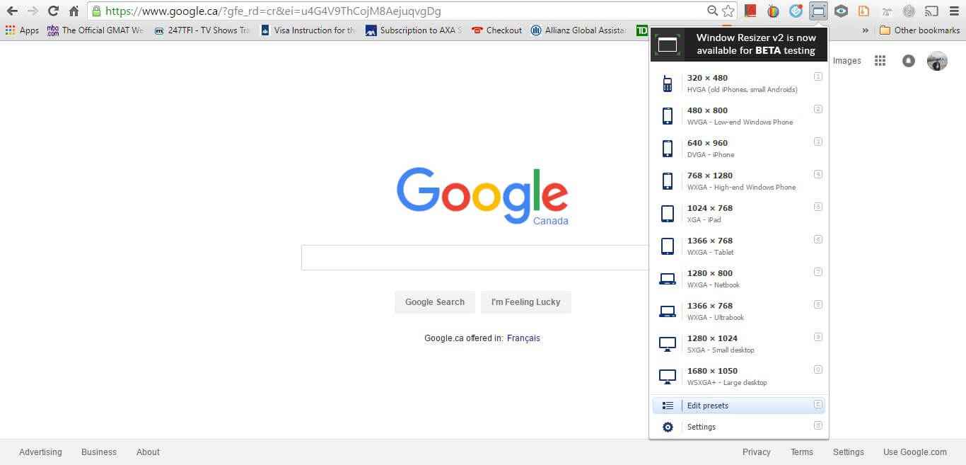
1) Changing the size of your browser: when you are testing the responsiveness of a web design, you can easily check the compatibility by changing the size of your browser. For example, if you go to below link: google.com and try to reduce the size of your browser screen, you would notice that the search bar has also moved to fix in the window size. Reduce it further and make it of a size similar to a smartphone, you will notice that the web page has adjusted to the size of the viewport of the device successfully. This method is perfect for a quick visual test for responsiveness.
If you have used the Google chrome web browser then you may notice that at the top right hand side of the browser, there is the viewport sizing option available as shown below. By using this option you can change the size of the viewport to that of a smartphone or a tablet and notice the responsiveness of the web design for that particular website. It is a quick and very easy option available to test the responsiveness of the web design across the variable viewport sizes of the multiple devices.
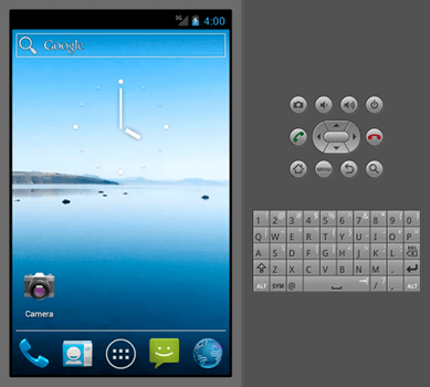
2) Emulators: These are the virtual mobiles or web based simulators depicting mobile device like environment. When you test RWD, you have to test it for various mobile devices and it could be costly to buy so many devices for testing purposes, emulators in such a case solve the purpose. It shows how a website would look and function on the mobile. Therefore, without buying the actual handset, we can test the web design responsiveness on the emulators which could save us the money.
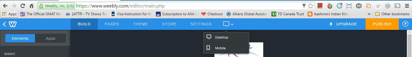
3) DevTools: Some website builder tools shows different options to see how your website design would look on different devices. For example, website builder by Godaddy, Weebly, wordpress, etc. are some of the development tools which have that option. I have attached a screenshot from weebly for reference. They are really very helpful since they have got 3 different sizes namely desktop, mobile, iPad or tablets.
- Online responsive checker: There are online free checker website available. You just need to put your website URL and check for responsiveness. They are very easy to use and you can get results in less than one minute.
Test cases for testing responsive website
Some of the important factors to keep in mind while testing the RWD are as follows.
- To verify all the images on the web page are displayed properly on all the different devices and resolution.
- To verify text and headings on the web page are properly aligned.
- To verify all the clickable links on the web page are readable and work as expected.
- To verify scrolling of the web page works as expected.
- To verify if there are input boxes and text areas to enter data then we need to make sure that the text entered is displayed properly on the web page and they are aligned as expected.
- To verify image size, Font size and font type are consistent across all the web pages.
- To verify if contents of the page are displayed consistent on all resolutions.
- To verify the color changes after hover over the elements.
- To verify the consistency of color combination on different resolutions.
- To verify images, text, different controls are not going beyond the screen border.
- To verify if there should not be any horizontal scrolling bar since everything should be fit according to the size of the screen.
- To verify on rotating your mobile device, all the contents should be rotated and displayed as expected without any technical glitch.
- To verify if the user able to click on clickable area.
- To verify padding of elements on the edges.
- To verify if enter text in input box are displayed as expected without any UI glitches.
Examples of responsive website testing:
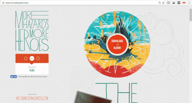
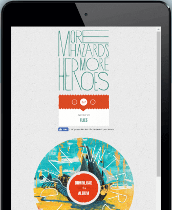
Example #1: www.morehazards.com
Note: Click on below image to enlarge the image.
Launch the URL on large screen like laptop/desktop:
Launch the URL on medium screen like tablet:
Launch the URL on small screen like mobile:

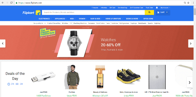
Example #2: www.flipkart.com
Launch the URL on large screen like laptop/desktop:
Launch the URL on medium screen like tablet:

Launch the URL on small screen like mobile:
Checkout on loading Flipkart website on mobile showing Filpkart Lite version.

These were some of the key points to remember. You should know the break-point of the web design, there are some websites with huge images and cannot be shrieked after a certain extent. It is important to know the breakpoints and decide how it will be shown on a smaller device. Sometimes, a picture tends to be hidden on the smaller device due to its huge size depending on the different screen size options as per display need. As simple is that, your website should look good and it should not break the website layouts when the viewport size is changed when that website is viewed on different devices.
Conclusion:
In this article, we have discussed the number of ways to test RWD (Responsive Web Design). At the same time it also depends on the kind of website that you are testing and what are the permissible data that you want to show on the website which may not be appropriate to show on a small screen devices due to their viewport size limitations. Therefore, the responsive website should be the one that should give the website the best look and feel across all variable screen sized devices.